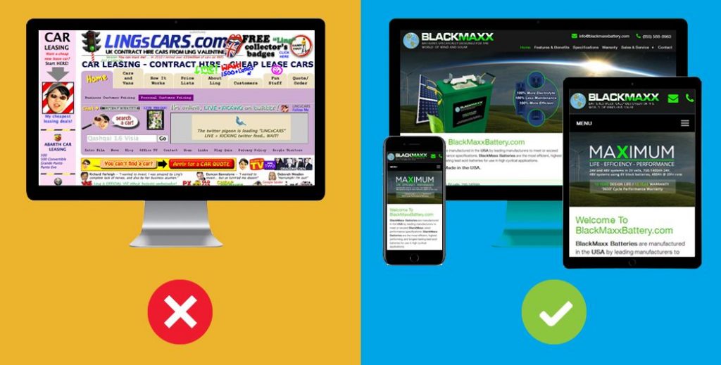
It takes about 50 milliseconds (that’s 0.05 seconds) for users to form an opinion about your website that determines whether they like your site or not, whether they’ll stay or leave.
Poorly designed websites are as good as having no website at all.
Via SWEOR
When Your Potential Customers Visit Your Website, What Do You Think is Their First Opinion of Your Website design?

Sure it’s 2020, by now, you’ve realized just how much effect your website can have on the credibility and value of your business to potential customers.
Statistics have shown that businesses that have an excellent online presence outperform their rivals who don’t. people tend to trust businesses who care enough to address their problems or seem to know exactly what they want/ need. Coupled with outstanding website design, you stand apart from your competitors.
Many businesses still dont have a clue how colossal this impact is, do you?
Here’s a sad scenario.
Someone sends a prospective client your way. They’re a warm, maybe even a hot lead.
Before contacting you, they do what everyone else does — they visit your website to check you out.
Then nothing. They don’t call for an appointment. No email inquiry. Nothing. Just crickets.
What happened?
Your poorly designed website scared them away.
Rather than give them confidence and establish trust, your business website did just the opposite. It created doubt, uncertainty and a general feeling of uneasiness about you and your business.
They click the “back button” on their browser and go somewhere else — probably to one of your competitors with inferior services to yours, but with a better website.
We receive lots of enquiries about getting websites done for businesses, and one thing we’ve discovered is that most businesses don’t have a clear goal for wanting to design a website for their business, and at such, they don’t have a budget for that, and won’t renew or maintain the website, simply because they don’t get any value from having set up the website in the first place. So we take our time to educate them on why they actually need a professional web design company to handle their affairs online while they focus on what they do best- running their business.

What makes a bad website design?
Why Do Business Websites Fail?
In Short: Websites fail because most business owners have a tendency to rush the process without having clear objectives. The website targets the wrong audience has poor user experience and there is little reasoning to why they need a website in the first place. This often results to, website not generating any value or ROI for the business.
Alright, how does bad website or poorly designe business websites contribute, let’s break it down;
The lack of professionalism
Your business website represents your brand on the internet, it shouldn’t look or feel like it was put together in a hurry by a high school amateur, and this goes a long way to affect every other point below, that’s why we recommend treating your websites like your storefront or business location and having it done by a professional web design company because it does a great deal of work for your business while you’re not watching or supervising.
Little or No Quality Content
Your business websites need enough quality content to able to convey a unique message to your customers, connecting to your potential client is the opportunity your website copy affords you.
Users spend an average of 5.59 seconds looking at a website’s written content
– Conversionxl
Imagine arriving at a website and there’s nothing (or almost nothing) there. Maybe you see a picture or two and a smattering of words, but nothing of value. Are you going to stick around? No way.
You need to get your potential customer to their destination; you need to capture their interest and provide them with what they want. Most people will be looking for information, so give them some substance. If you’re a business, this means letting visitors know what you do and including descriptions and pictures of the products and services you offer. Reviews or testimonials make it even better!
Contact Information MIA
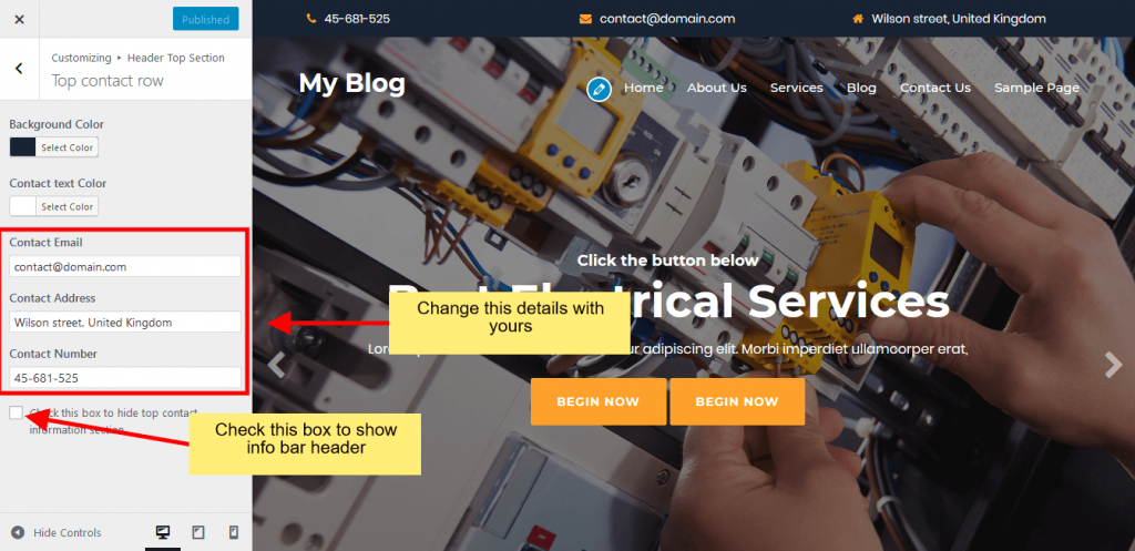
Something as simple as having your (clear) contact information in an obvious place can add legitimacy to your site and go a long way in building trust with potential customers. Be sure that your phone number, email address, and physical address (if you have one) are easy to find.

Slow Website Load Speed
Let’s just looks at the stats..
Slow-loading websites cost retailers $2.6 billion in lost sales each year.
47% of Users expect a maximum of 2 seconds loading time for an average website
39% of people will stop engaging with a website if images won’t load or take too long to load
– Hubspot, Curatti….
Plus, you get a very bad user experience if your site is too slow, bad ranking on search engines, and low conversion on your business website. Tha takes us to
Bad UX – User Experience
People visit your site to gather information about your company or products. Don’t make them work too hard to find what they need! Two things that make for simple organization?
- An easy-to-find search box — This allows customers to quickly hone in on exactly what they’re looking for.
- Headings – They should let the visitor know what kind of content they can expect to see in every section. This is beneficial for SEO purposes as well!
77% of agencies believe that a bad website User Experience is a weakness for their clients.
88% of online consumers are less likely to return to a site after a bad experience
– Slideshare, invisionapp
This makes bad UX the most significant weakness agencies identified
It seems as if there may be a pattern here:
User experience and design are not separate concepts. They couldn’t be more connected.
There are more features of a bad website design like
- Not mobile-friendly.
- No clear call to action.
- No structure or modern layout.
- Content targeting the wrong audience.
While theres no way of measuring exactly how much you’re losing, I hope you get the point.
What Does This Mean For Business Owners
These attributes discussed above all have one thing in common, they make your potential customer click the browser back button and move to your competitor. Your site should be welcoming and allow people to choose their experiences by visiting specific pages, getting information they need and satisfying their inquiry. They’ll respond so much better to this than having a multimedia extravaganza chosen for them.
To see meaningful results from your website, you don’t necessarily have to invest in an expensive web designer or go all out with a complicated design. Remember, the aim of your site should be to benefit those looking for information about your business and products. Keeping it simple is sometimes best. By keeping in mind what makes a bad website and implementing a few of the advice in this post, you’ll be one step closer to converting those site visitors to customers.
The Bottom Line

75% of consumers admit to making judgements on a company’s credibility based on the company’s website design
What it means:
When you think about it, it’s pretty incredible that the credibility of a company is so powerfully linked to the aesthetic quality of its website.
But it’s 2020, and a website serves as a window into the way a company operates. As such, it needs to exude credibility in every sense of the word.
How to fix it:
When it comes to portraying credibility on a company website, step one is to have a modern, updated design that shows your company cares about its digital presence. This includes implementing all of the aspect ratio, image, font and layout information we discussed above.
But credibility is also driven through a website’s content, and content should always go hand in hand with design.
What do I mean?
A website’s content can be anything from images or videos displayed on the site to blocks of text describing your services, or a large headline. The way these pieces of content are integrated with your site’s design is just as important as what they say.
Good design relies on a seamless integration of quality, informative, and credibility-boosting content into the overall fabric of the site.
Make sure that your website’s content—whether in the form of images or text—reinforces its design. This way high quality aesthetics are bolstered with evidence of success, brand-defining statements, and images that keep users interested and engaged.
SilvaCreate offers you the chance to do what you do best – running your business, while benefiting from our years of collective experience to build solutions that will drive growth and new customers to your business day and night.
Begin the process of building a website with good and credible designs that will inspire your potential customers. Get Started Today


